

Tranztec EDI is an internal tool used to map data between different formats, taking an X12 EDI file from a trading partner and translating it into something the company's systems can actually use. It's not glamorous work, but it's the kind of backend process that keeps logistics moving.
The existing tool worked; users could get their job done with it. However, it was painful and the team knew it. I was brought on as the sole designer to fix and reorganize the interface, with one specific note from leadership: the center of the screen was functionally useless. Yet, they couldn't quite articulate why.
My role
Sole designer, end-to-end. I owned the research, design, and developer handoff, partnering closely with engineering, product, and two SMEs who knew EDI inside and out.
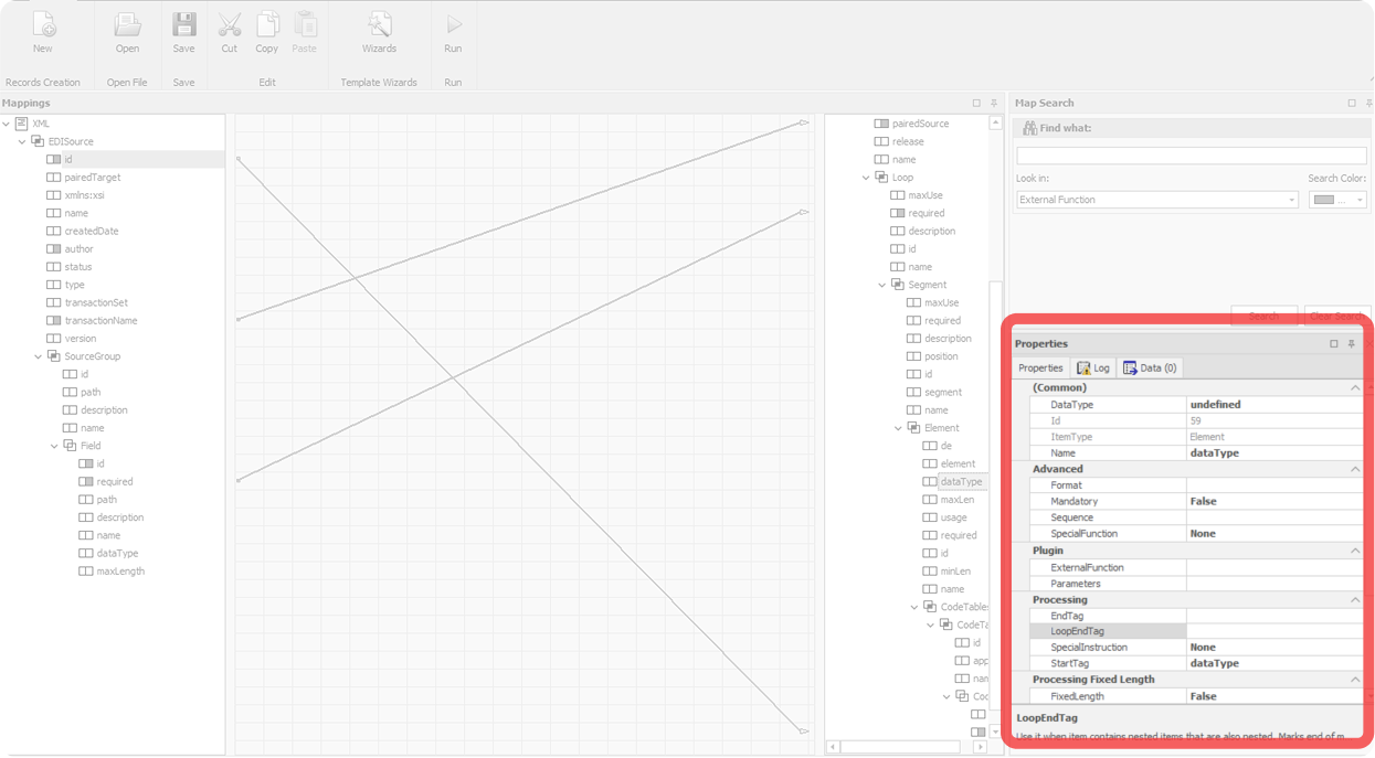
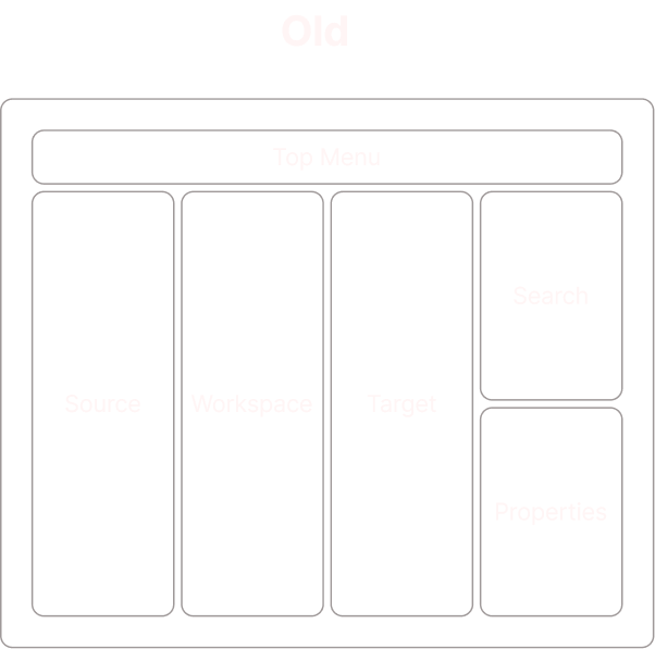
A top toolbar with file actions. Two tree panels in the middle, source on the left, target on the right, listing every field in the EDI document. A canvas in between where lines were supposed to show connections. A search panel and properties panel stacked on the right side.
The bones were reasonable. Source and target trees made sense. Properties had a home. Search existed. The pieces of an EDI mapping tool were all there.
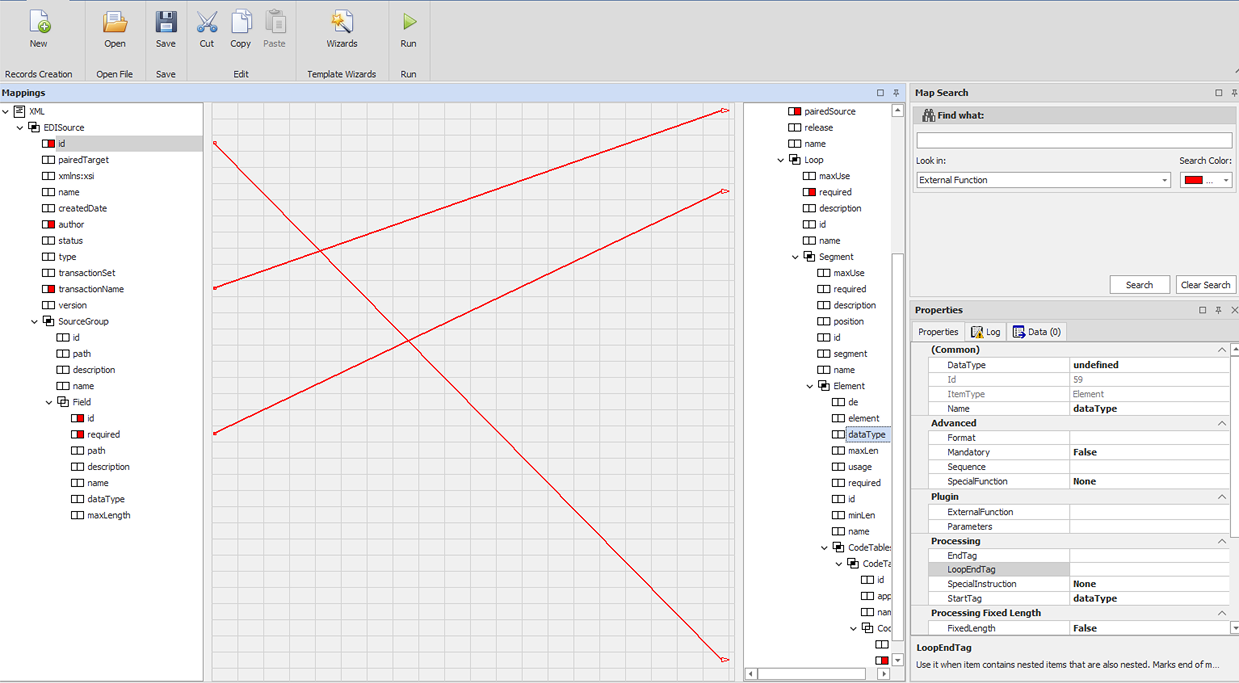
The pieces were all there. They were just in the wrong places.
Source and Target
The strongest part of the existing tool. Still, variable mappings and conditional connections weren't visualized. Mapped fields lit up red, easily confused for error warnings.
Workspace
Lines only rendered when both endpoints were scrolled into view at the same time, which in any real EDI map almost never happened. Users learned quickly to ignore the entire center of the screen.
Search Panel
Search lived alone in the corner, disconnected from the trees where results appeared. It even had a "Search Color" picker: a feature bolted on rather than designed in.
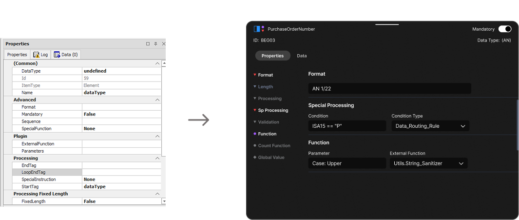
Properties Panel
Every possible property field was visible, whether active or not. Users couldn't tell at a glance what was configured versus what was just sitting empty.
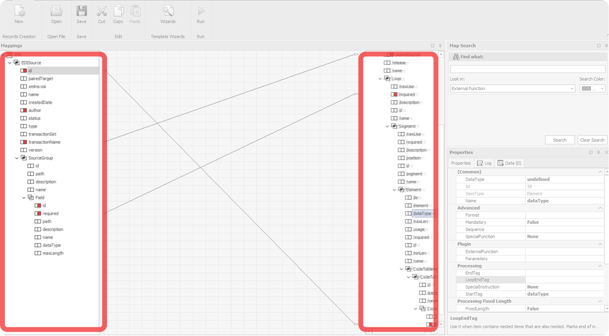
The strongest part
Still, variable mappings and conditional connections weren't visualized. Mapped fields lit up red, easily confused for error warnings.
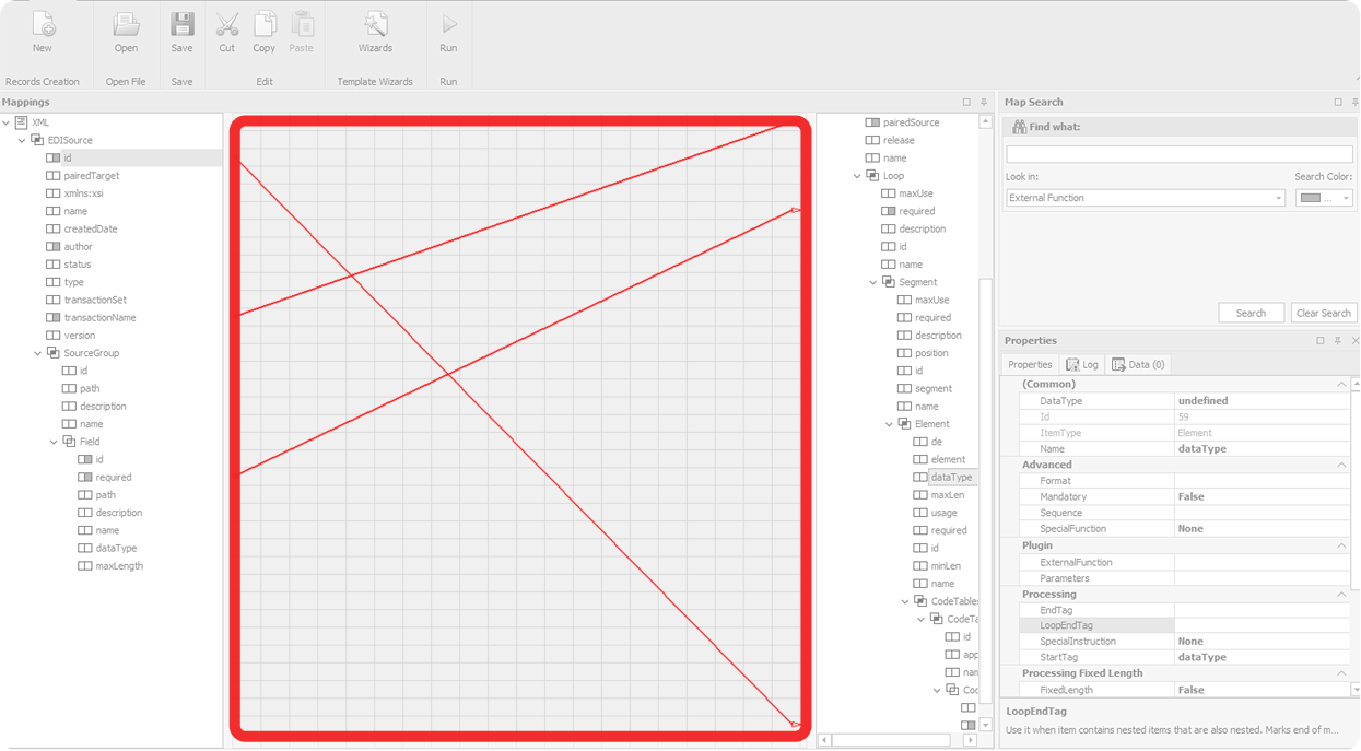
The useless center
Lines only rendered when both endpoints were scrolled into view at the same time, which almost never happened. Users learned to ignore the entire center of the screen.
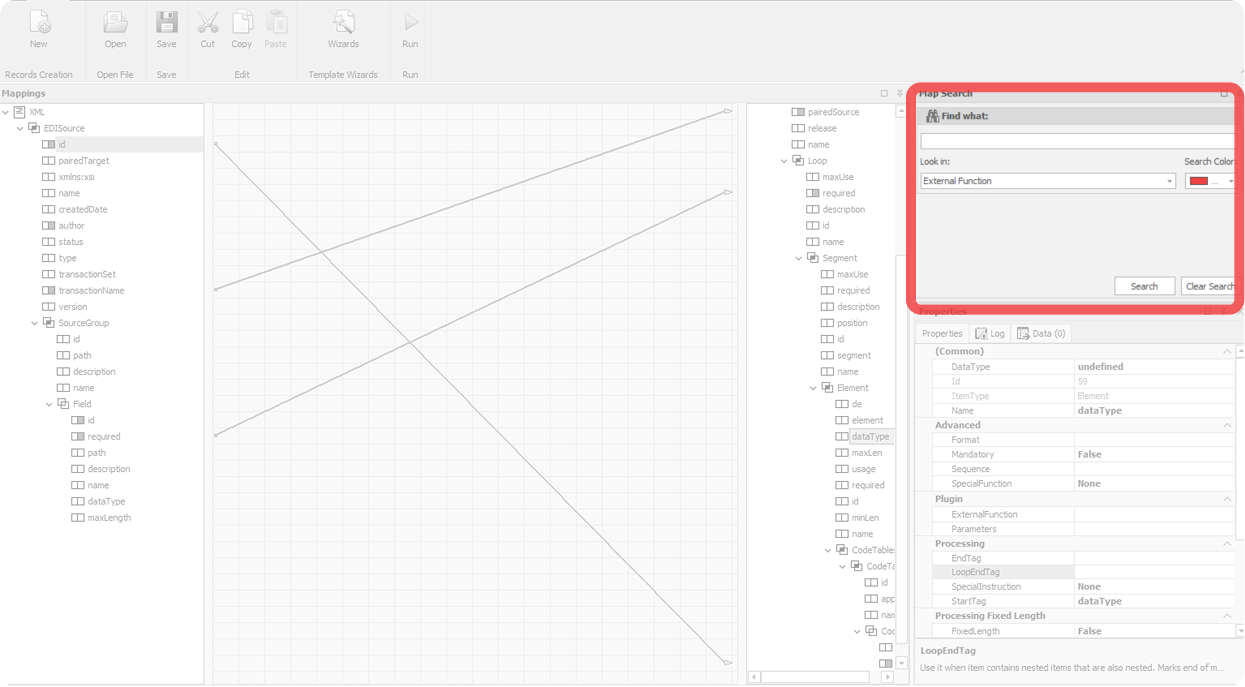
Off in the corner
Search lived alone, disconnected from the trees where results appeared. It even had a “Search Color” picker: a feature bolted on rather than designed in.
Everything visible at once
Every possible property field was visible, whether active or not. Users couldn't tell at a glance what was configured versus what was just sitting empty.
"It is worse than useless."

— Dave, SME (blurred out of respect)
Before I could redesign anything, leadership gave me a hard rule: preserve every field, every property, every behavior. Existing users needed to be able to transition smoothly. The redesign was a reorganization, not a rebuild.
This shaped everything. I couldn't simplify by removing functionality. I couldn't introduce new metaphors that broke muscle memory. The job was to take everything that already existed and put it where it should have been all along.
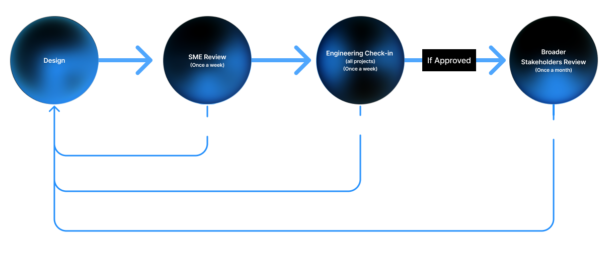
The feedback loop ran like this: I'd design, share with Dave for SME feedback, refine, present to a broader stakeholder group monthly, refine again, and check in with engineering throughout. Designs that survived all four touchpoints made it into the build.
Research was lean by necessity, only two people in the company had deep EDI expertise. When alternatives came up, I'd present them side by side and gather reactions. It wasn't a big team, but the cadence was consistent, and the feedback was direct.
Initial feedback pushed us toward two workspace directions.
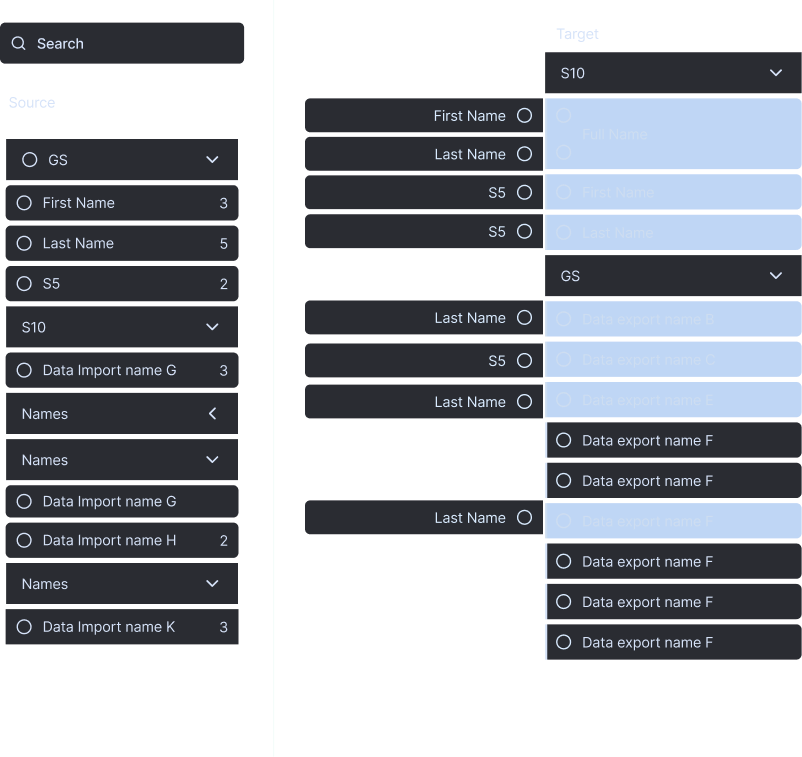
Direction A
Buckets
Group related fields into collapsible categories to simplify the view.
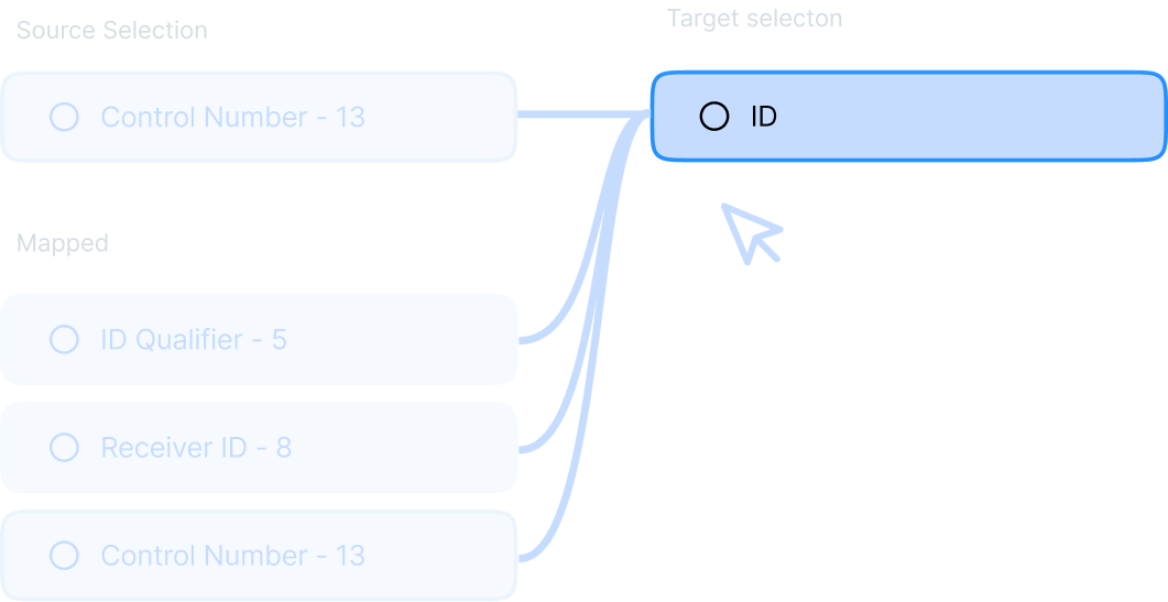
Direction B, almost shipped
Micro-view
Keep lines, but only show the relationships of one selected element at a time. Pick a field, see its mappings. This was the version that almost shipped. Then, engineering looked at it.
"Please, no lines."

— Zach, Lead Dev (blurred out of fear)
Lines became icons. Badge counts carried the connection numbers. Colored indicators carried the connection types. The workspace stopped trying to render lines it didn't need to render. Was I a little sad about losing lines? Sure. Are icons probably the better answer at this scale anyway? Almost certainly.
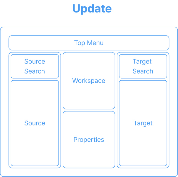
A better structure.
The structural shift came down to five moves.
Icon logic.
The new icons were grounded in the originals, same basic shapes, same general placement, but simplified to put color and form to work. The system builds up from the base icon to the worst-case row.
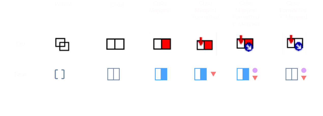
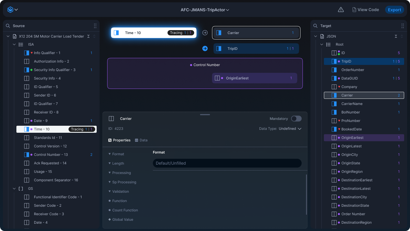
Reading the counter
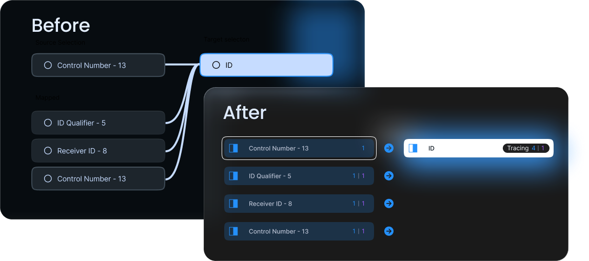
At the end of each row, a dual-color counter shows how many connections the field has, blue for direct mappings, purple for variable mappings. A field reading "3 | 2" has three direct connections and two variable ones. The counter lets users spot heavily-mapped fields without expanding, the global awareness the spaghetti lines were supposed to provide, but never did.

An interactive legend.
The icon system gets its meaning from the properties panel, and vice versa. Activating a property in the panel produces the corresponding icon on the field. The panel teaches the system through use.
The old panel showed every possible property field at all times. The new panel shows only active sections expanded. Indicator icons appear next to their corresponding sections. Users can predict that activating "Sp Processing" will produce the red triangle. The icons aren't documented in a separate legend, the panel is the legend.
This was the design decision I'm most proud of. It solves the discoverability problem, how do users learn what the icons mean?, without adding any explanatory chrome. They learn by doing.
How the new tool actually looks.
Windows layout, everything visible at once, nothing in focus
Dark theme, focused workspace, dense but legible
Mapped connections flow left to right, the same direction users read and the same direction data actually moves through the system. The arrows pointing right aren't decorative; they reinforce the spatial logic of the whole tool.
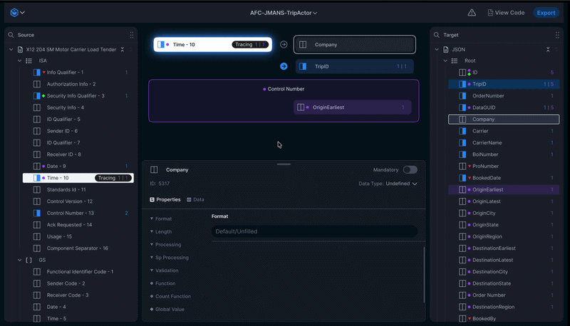
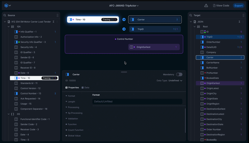
Making a mapping
Source anchor stays put on the left. The user clicks a target on the right, and it appears in the workspace as a candidate with a greyed-out arrow. Clicking the arrow confirms the mapping, arrow turns blue, badge count updates. One click to stage, one click to confirm. The greyed-out arrow is the affordance that teaches the blue mapping state without needing a tooltip or legend.
Tracing connections
With a source anchored on the left, the user clicks 'Trace' on a different target field and watches the workspace update around them. The workspace becomes a single-anchor lens into the larger map, letting users navigate hundreds of fields by exploring one relationship at a time rather than trying to comprehend the whole graph at once.
I would have done it all [some of it] differently.
Testing with example data
The old tool didn't let users pass sample input through their map to see what the output would look like. They built maps, exported them, ran them against real files in a separate system, then came back to fix anything that broke. A live testing surface, paste in a sample EDI file, see how each field flows through the map, watch transformations apply in real time, preview the final output, would have been a massive quality-of-life improvement. It's the first thing I'd add in a v2.
AI as a mapping collaborator
This redesign was scoped before AI assistance became a viable product surface. The most obvious applications: surfacing likely mappings based on field name and type analysis, learning from a company's historical mapping patterns to pre-suggest connections for new trading partners, and pre-populating variable mapping logic for common transformations like date format conversion.
The design challenge wouldn't be technical, the models are capable of all of this. It would be preserving user agency. EDI mappings have real downstream consequences when wrong, so the right frame is suggestion-and-confirmation, not automation. Where AI suggestions live in the workspace, how confidence gets communicated, how users reject a suggestion without dismissing the feature entirely, those are the design questions I'd want to spend time on.
Tranztec UI Kit
One component, three densities. White-label theming, graded for WCAG contrast.
 © 2026 Anthony Carmine Pietramala